Project Overview
The design system project, named „Pulse,“ was undertaken during my time at Min Doktor and later at Docly. Min Doktor operates as a Swedish healthcare company, while Docly serves as the international platform provider.
The objective was to unify the design assets of the company in a pattern library and prepare them for scalability. As the organisation aimed for internationalisation, the design system needed to support multiple languages. It was a pivotal moment following a rebranding initiative, providing an opportunity to streamline and combine diverse assets into a cohesive design system.
While we had a team of designers, I was asked to create the initial version of the system. This meant consolidating and categorising design assets in Figma and rebuilding components to leverage Figma’s features.
Process
Being the first project of this kind for me, I dove into research about how other companies presented and utilised their design systems. Inspiration was drawn from MaterialUI’s component grouping on their website, which guided the structuring of our pattern library in Figma.
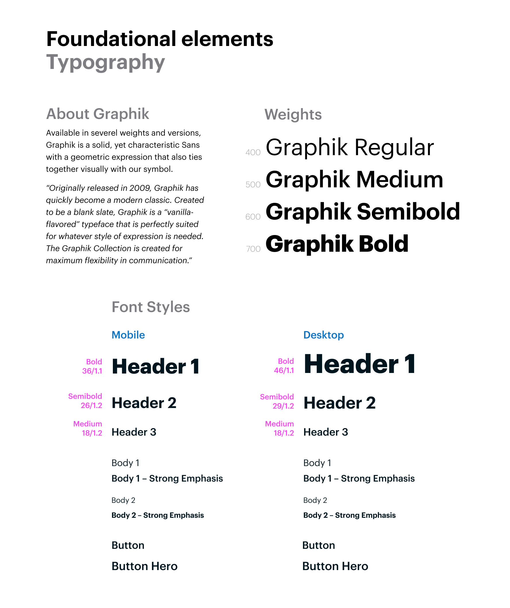
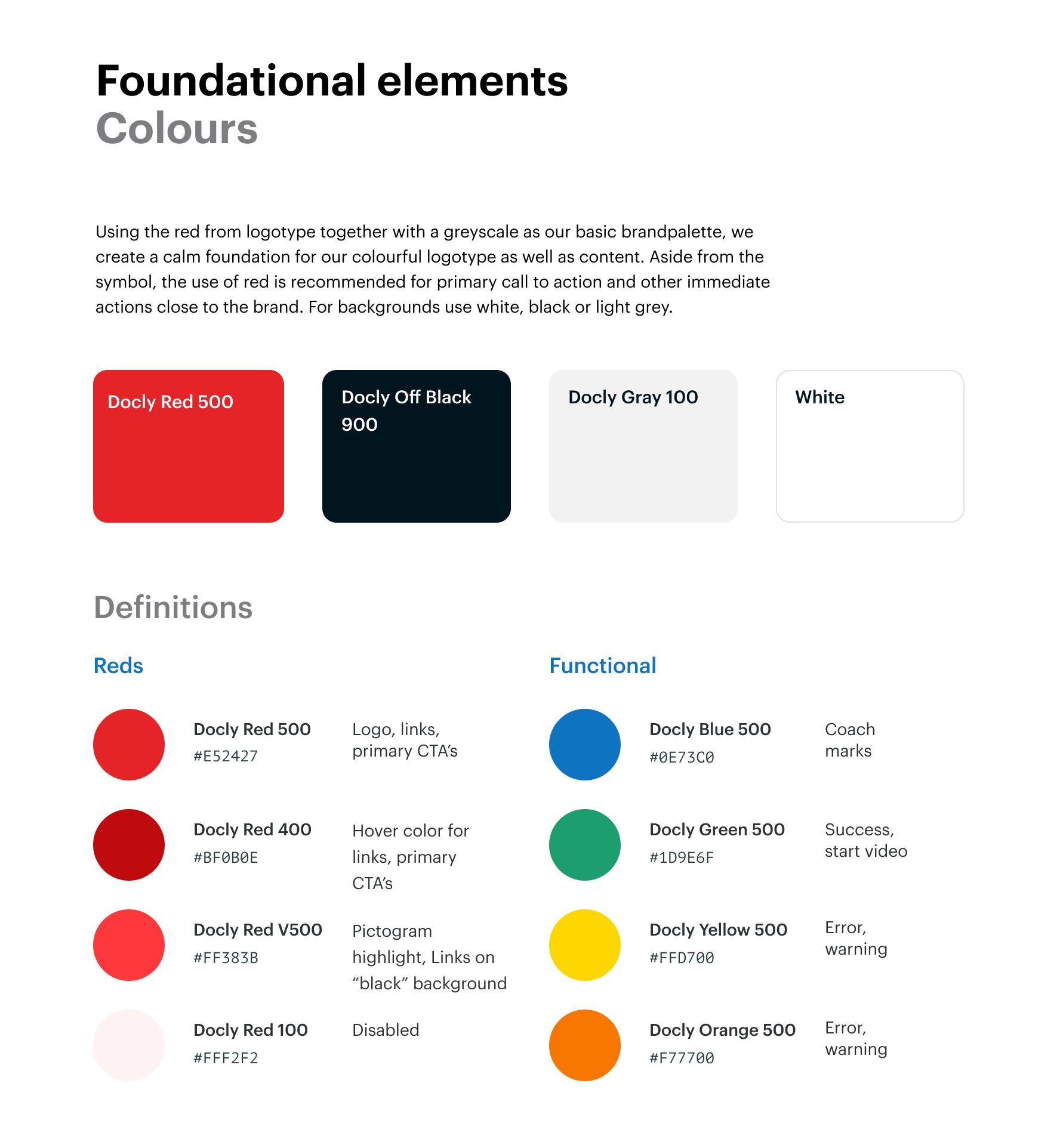
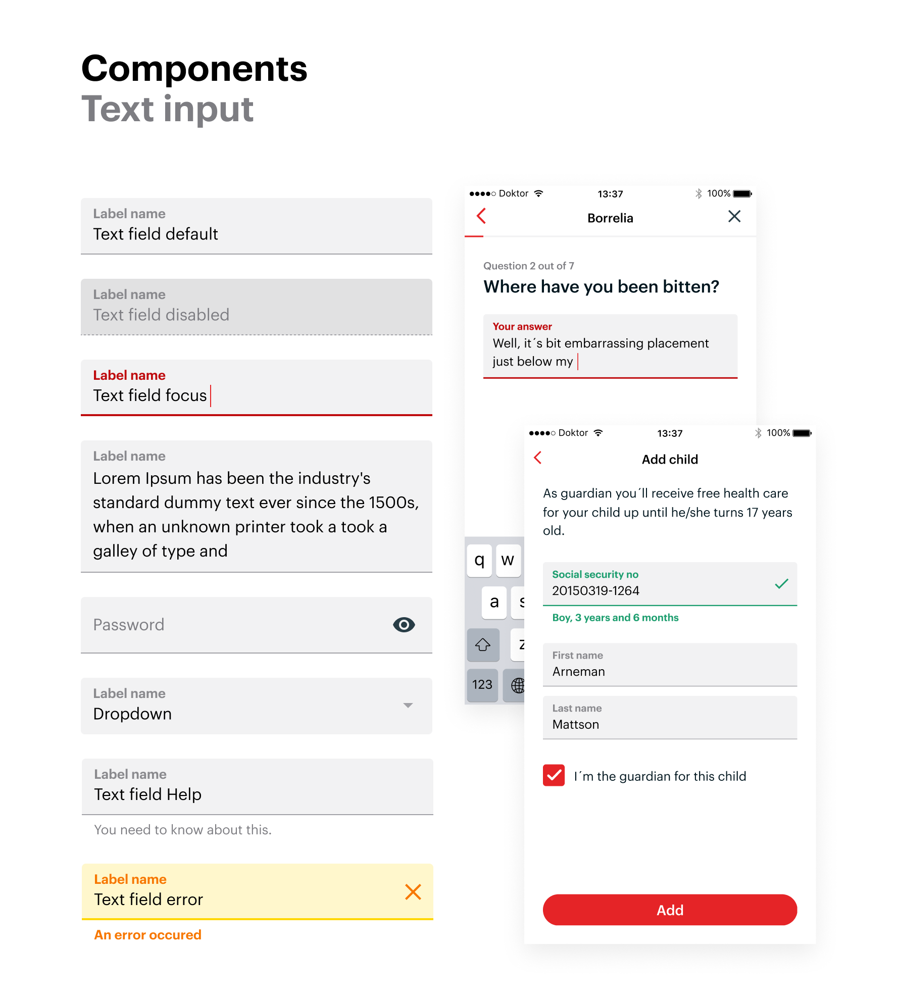
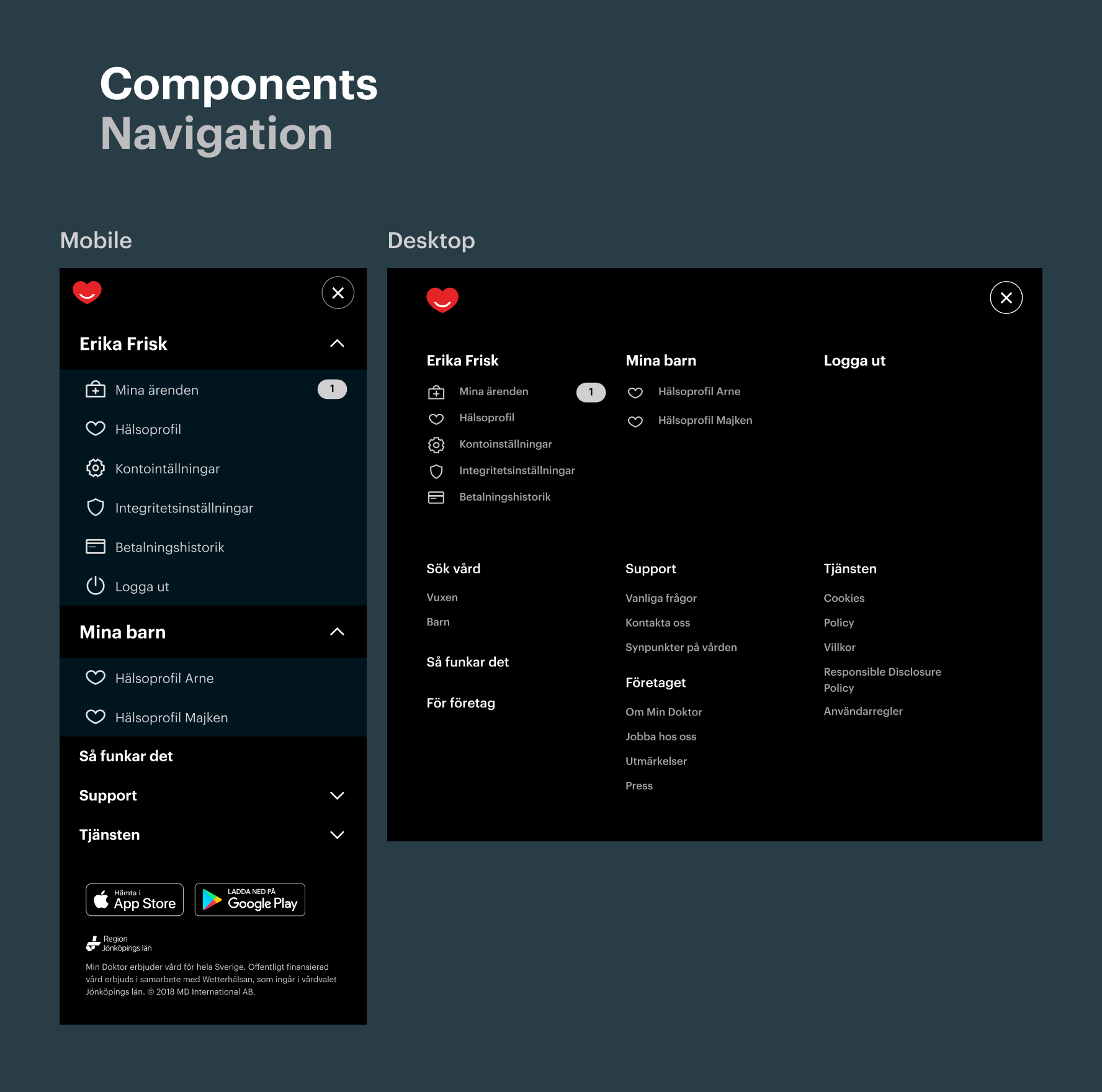
After establishing the structure for the design system, I reviewed and mapped all existing design files and assets. This process focused on identifying duplications, consolidating artefacts, and aligning them with the predetermined structure. I followed the principles of atomic design, starting with foundational elements like typography and colours, and progressively building up to complex components such as menus, navbars, and screens.
I followed Figmas best practices at the time to ensure consistency and scalability, leveraging component naming conventions for easy grouping and maintenance of component states.
To get buy in from the design team I met them regularly, presenting my progress and facilitating discussions around specifics where applicable. We discussed the level of detail needed a few times since we did not want a system that was too restrictive but would still allow for experimentation.
Implementation and Adoption
The main challenge during implementation was dealing with legacy files that were not yet linked to the design system. To overcome this, we opted for a phased approach, implementing new components and updating screens as needed during ongoing product development. A similar approach was used to get traction among developers. Components were developed in conjunction with feature development.
Outcomes and Impact
The design system project yielded positive outcomes and benefits. It significantly improved consistency among different designers, reducing copy-and-paste errors and uncertainty about the latest design artefacts. Teams could concentrate more on feature development and experimentation, leading to enhanced productivity and a streamlined design process.
Reflection and Lessons Learned
A key lesson learned from this project was the importance of involving developers early on in the design system process. While the project achieved its objectives within the design realm, advocating for similar implementation efforts in the codebase posed challenges. A cross-functional team approach would have enabled early identification of code implementation difficulties and fostered a sense of ownership among developers, facilitating wider adoption and smoother integration.
 MENU
MENU
