Design Systems at Joint Academy
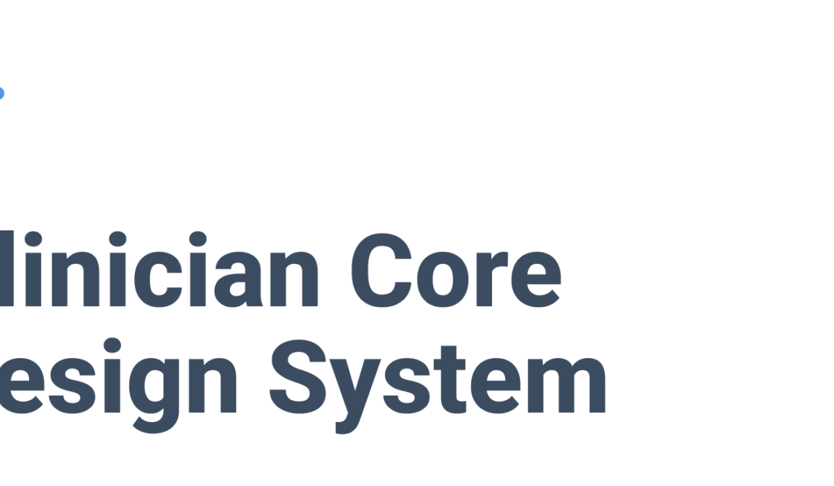
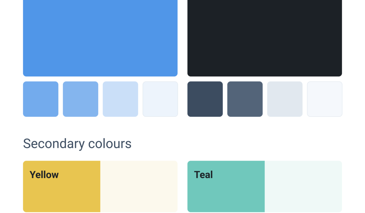
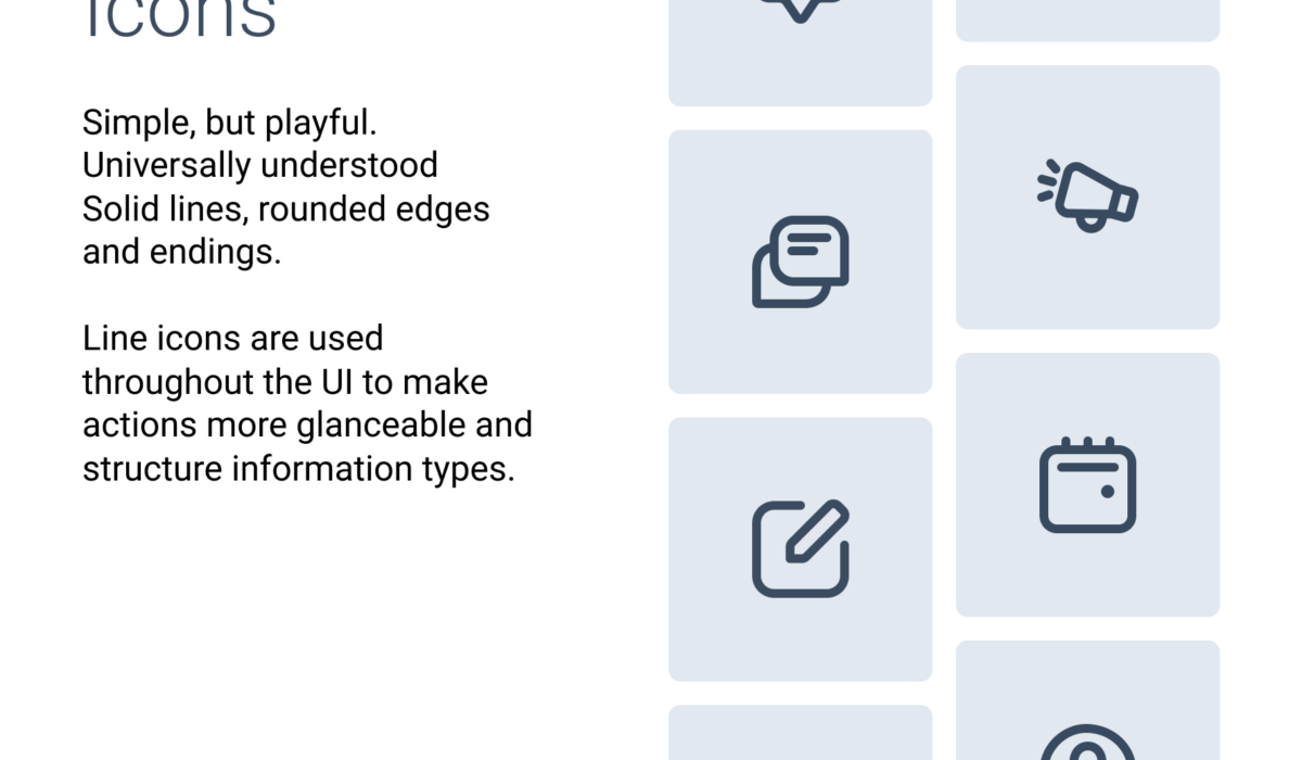
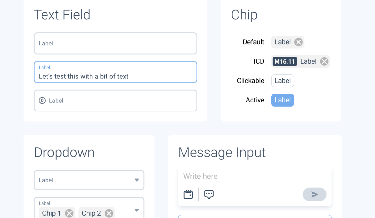
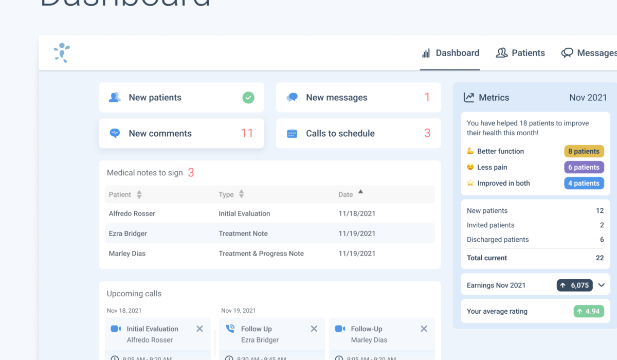
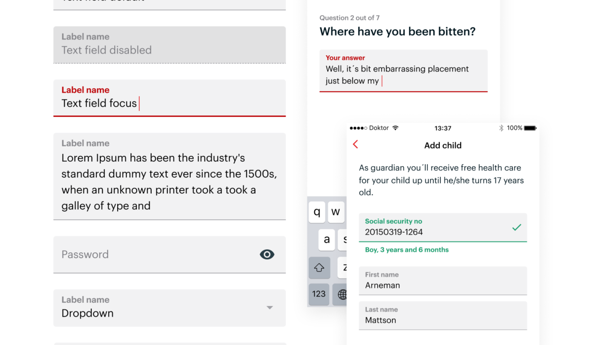
Overview Joint Academy is a Swedish healthcare provider that specializes in digital physiotherapy services for patients with chronic joint pain. During my time at Joint Academy, I worked on two separate design systems: one for end users/patients and the other for the medical professional app used to administer care. The patient-facing system already existed when I started, and I helped refine it in combination with a tool change from Sketch to Figma. However, my focus was mainly on the professional-facing system, dubbed the „Clinicians Core“ system or CC for short. Process Building the design system for the Pro App was different from building a typical design system. Instead of being its own project, building it happened continuously while developing features. At the time, there were no design files for the current state of the Pro App. So, building out the pattern library had the additional benefit of remedying that. I started by setting goals for building this system: Establishing and formalizing UI patterns for the clinicians‘ app. Preparing for the expansion and internationalization of the product. I used Atomic Design principles to set the structure of the design system and then built components on an as-needed basis. One of […]
Read More ›
Pulse Design System – Docly
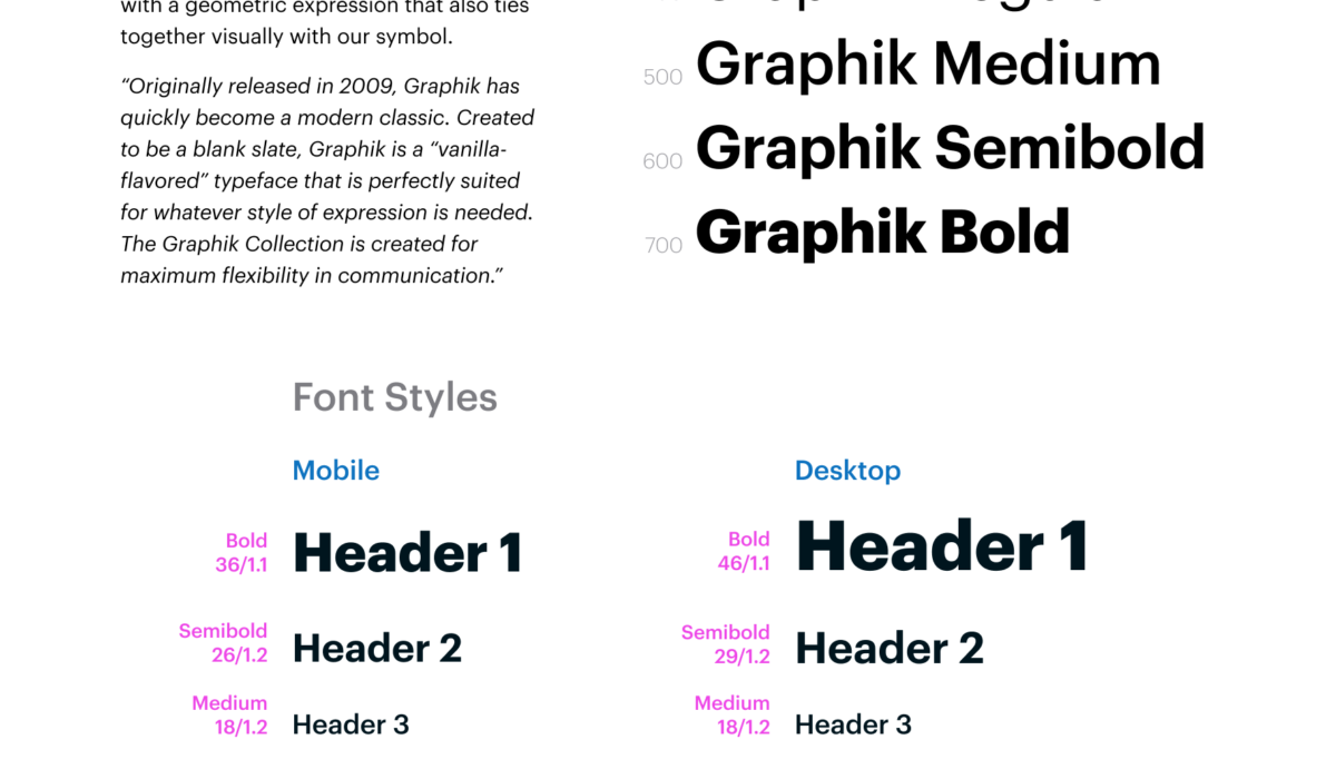
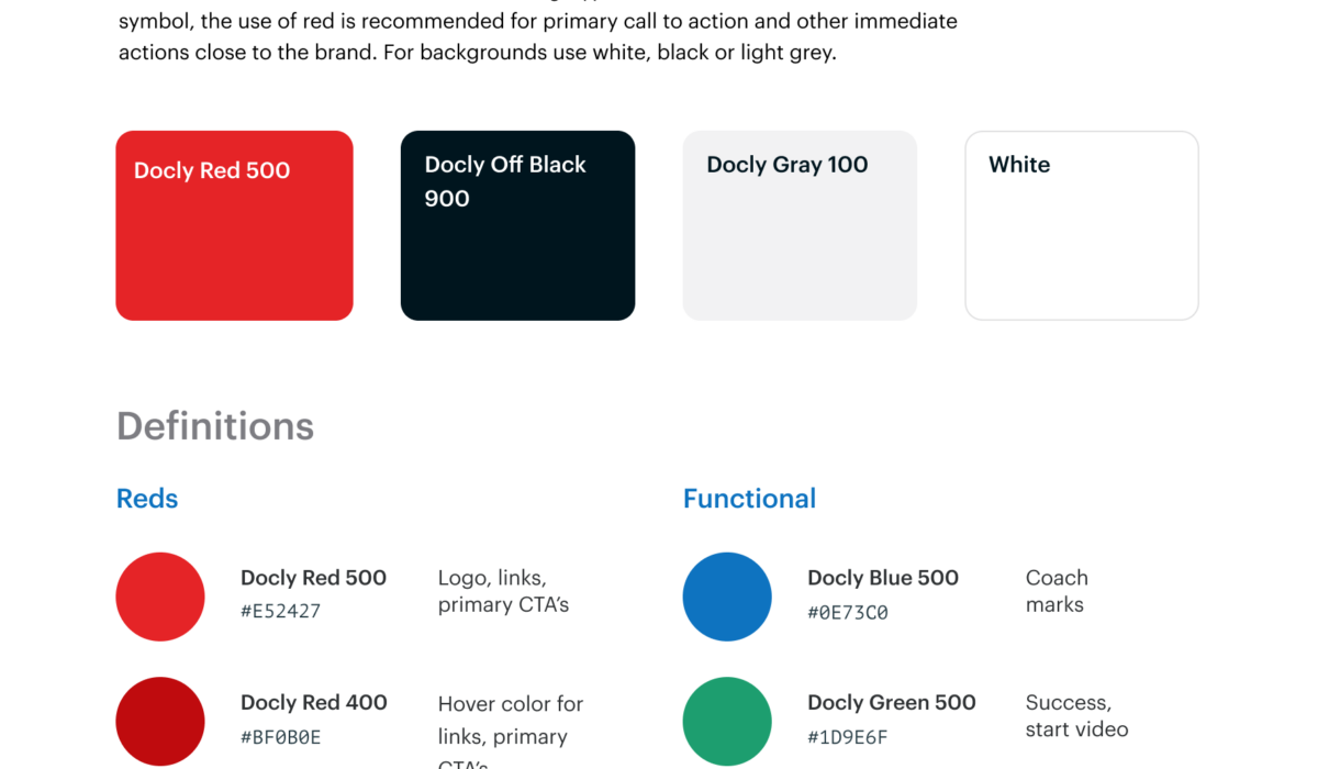
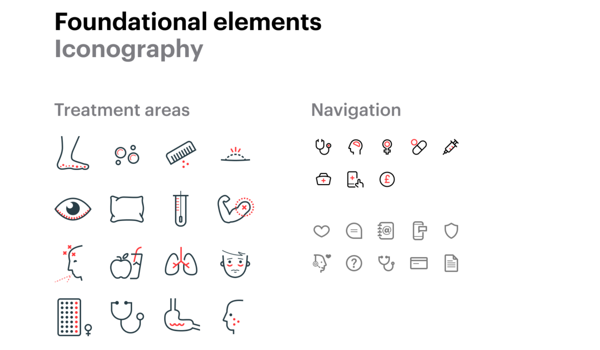
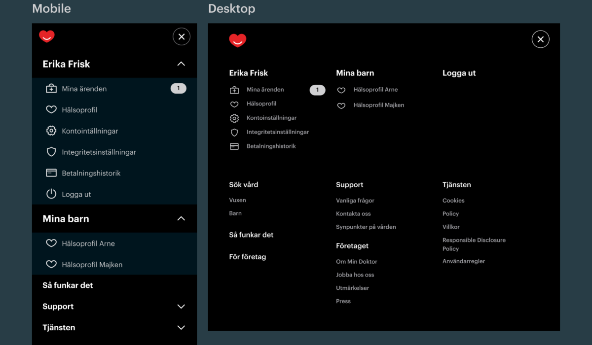
Project Overview The design system project, named „Pulse,“ was undertaken during my time at Min Doktor and later at Docly. Min Doktor operates as a Swedish healthcare company, while Docly serves as the international platform provider. The objective was to unify the design assets of the company in a pattern library and prepare them for scalability. As the organisation aimed for internationalisation, the design system needed to support multiple languages. It was a pivotal moment following a rebranding initiative, providing an opportunity to streamline and combine diverse assets into a cohesive design system. While we had a team of designers, I was asked to create the initial version of the system. This meant consolidating and categorising design assets in Figma and rebuilding components to leverage Figma’s features. Process Being the first project of this kind for me, I dove into research about how other companies presented and utilised their design systems. Inspiration was drawn from MaterialUI’s component grouping on their website, which guided the structuring of our pattern library in Figma. After establishing the structure for the design system, I reviewed and mapped all existing design files and assets. This process focused on identifying duplications, consolidating artefacts, and aligning […]
Read More ›
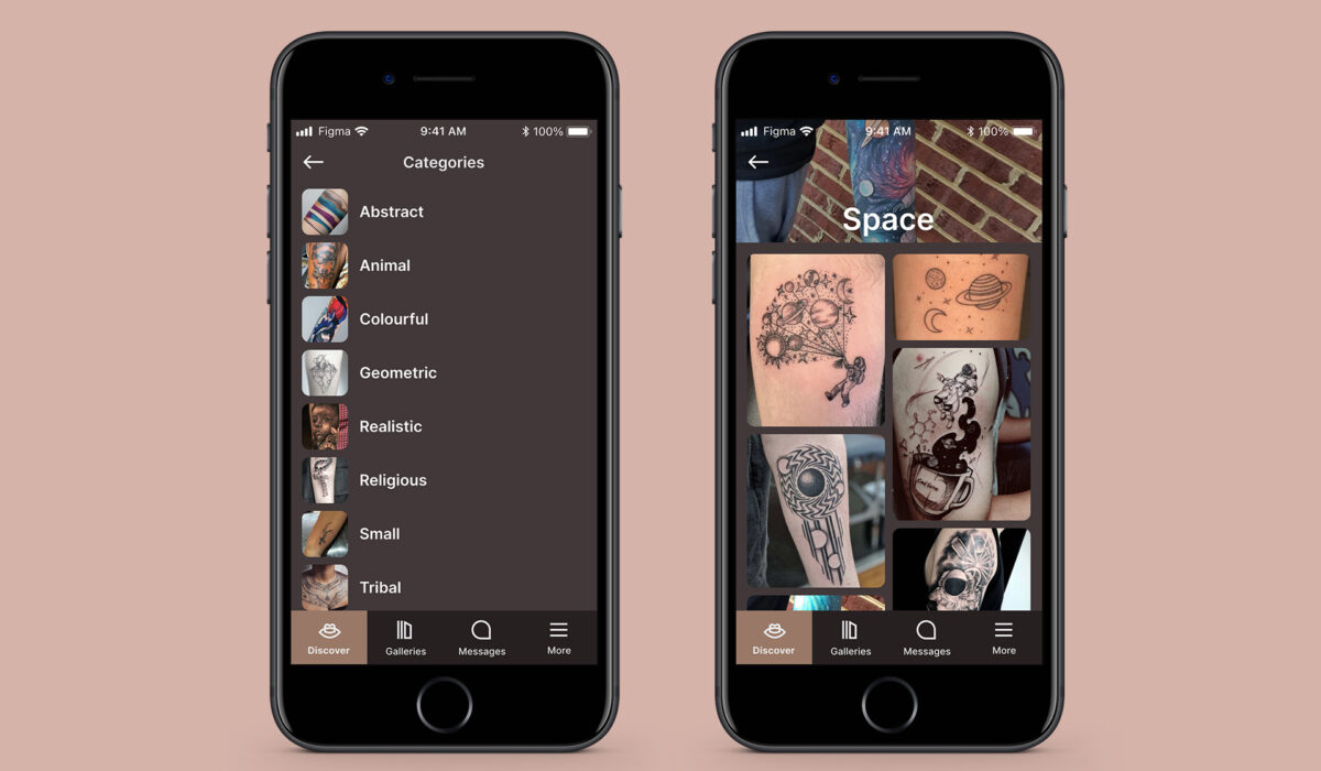
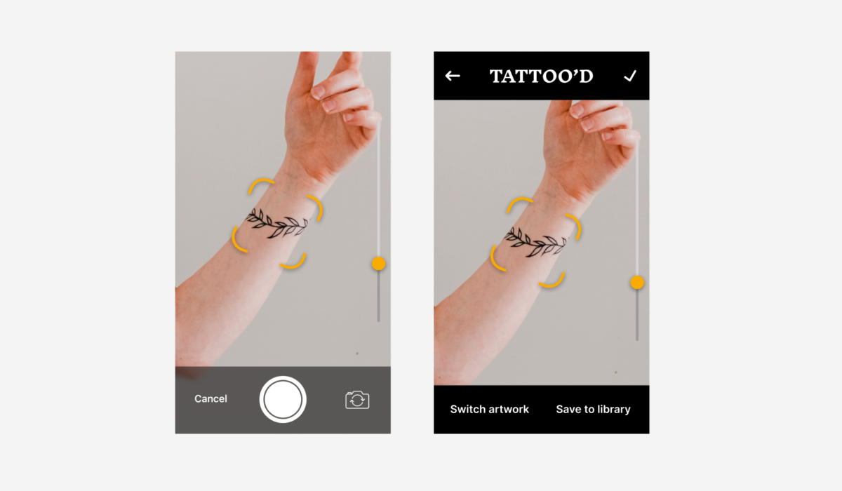
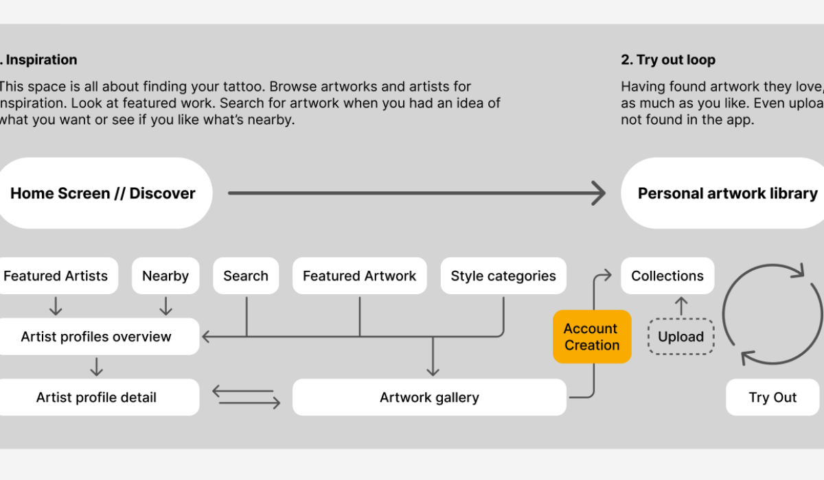
Tattoo’d
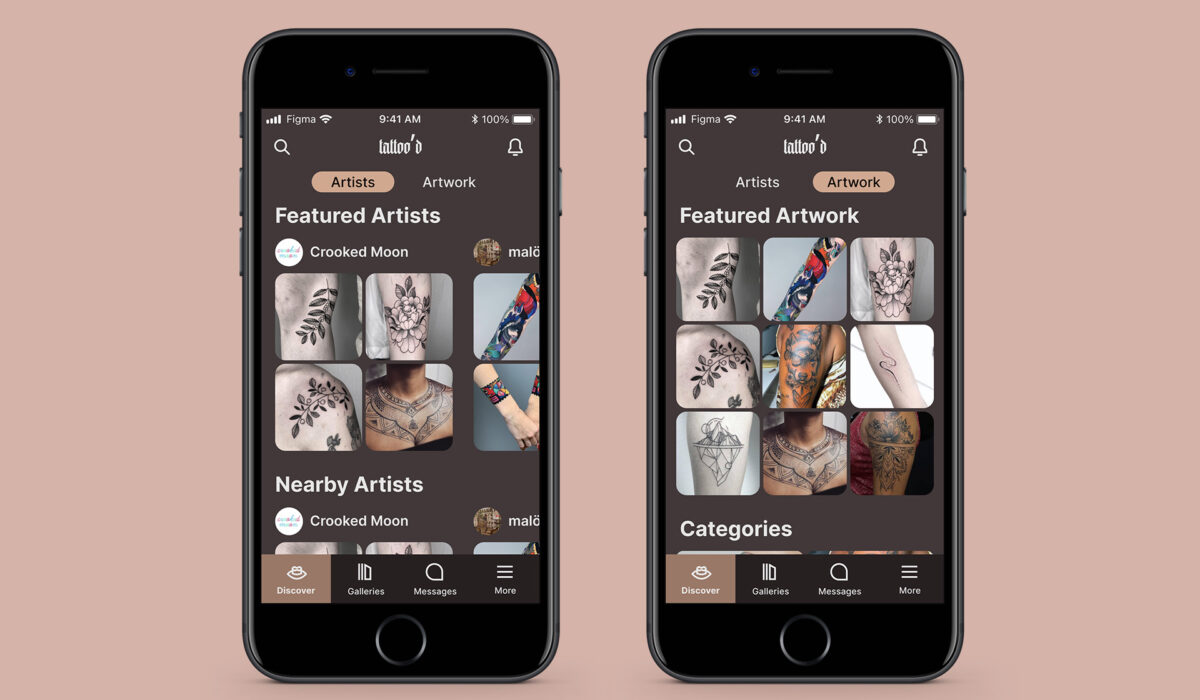
TL;DR The project aimed to design an end-to-end flow for the tattooing process, from inspiration to completion. The solution consisted of an app with four main areas: finding artwork, trying out tattoos, booking appointments, and aftercare. The app allows users to curate artwork, try out tattoos on their body in AR or photos, communicate with artists, and purchase care products. Concept The tattoo’d project was part of my application to the Swedish consultancy tretton37. As someone with an interest in tattoos and being tattooed myself I chose the following task: ”Seeing how it’s still difficult to change or remove tattoos once you’ve got them, it would be beneficial to have an ability to preview the results beforehand and thus make more informed decisions. Design an end-to-end flow covering the journey from a moment of inspiration to the completion of the tattoo.” My Process My overall process was as follows: Understand and reframe the problem. Explore the problem space by conducting research. Explore various designs, test them, and focus on the best solution. Present the chosen solution. The problem reframed to a How might we-question became this: How might we make it easier to commit to a lifetime of […]
Read More ›
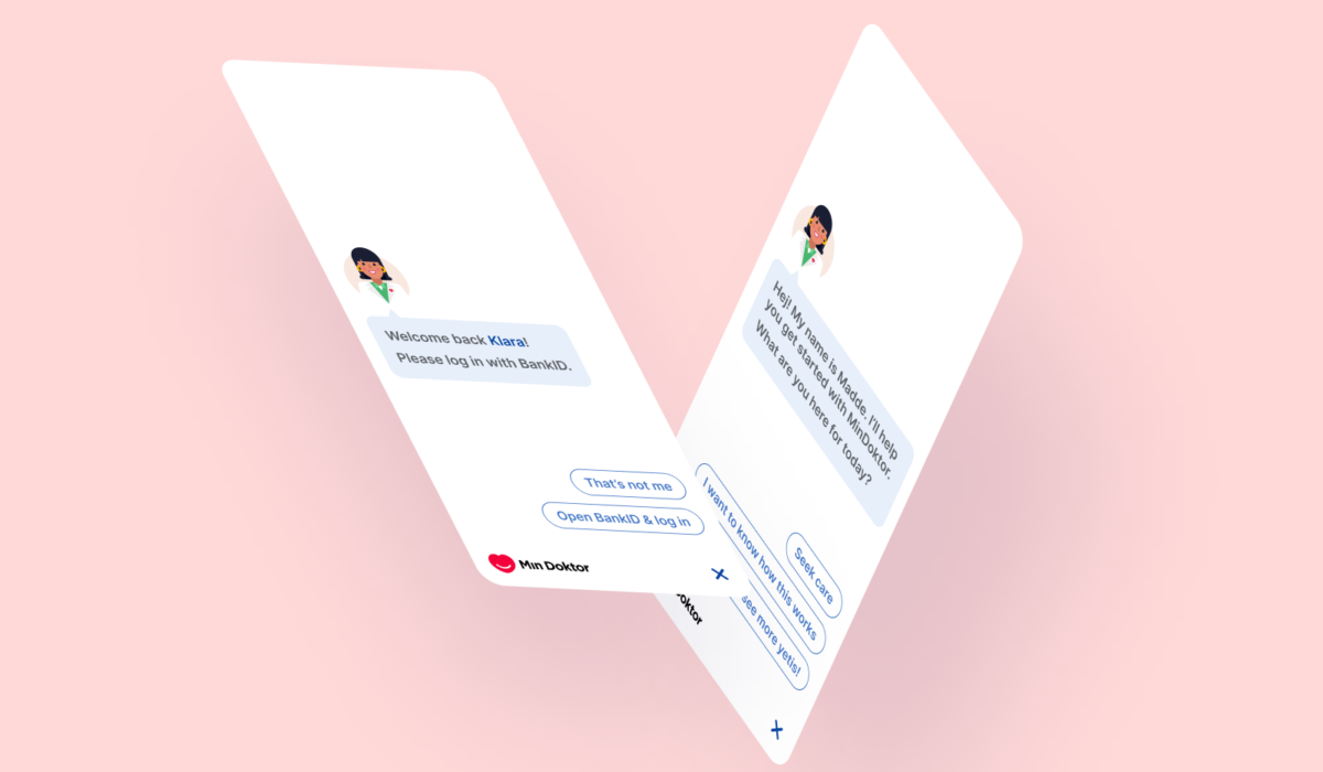
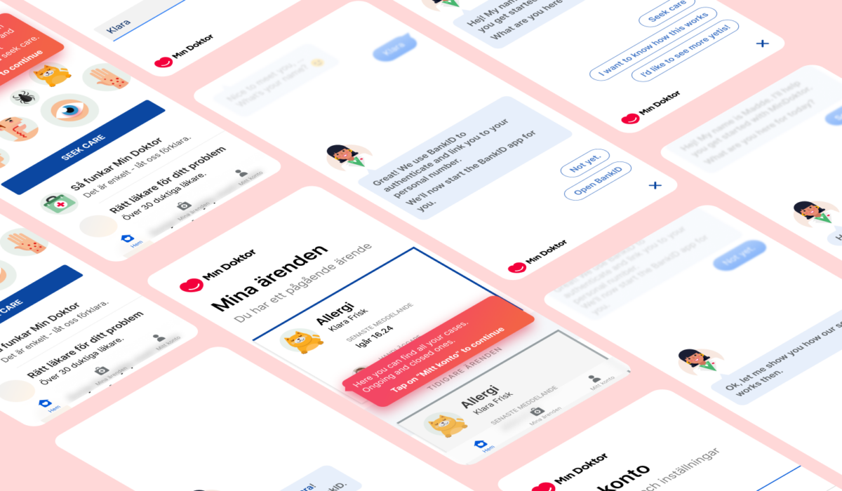
Min Doktor – Conversational UI
TL;DR Min Doktor is a med tech service in Malmö, Sweden where patients can get medical help by answering a questionnaire and chatting with a professional. Conversational UI that focused on a seamless experience from logging in to chatting with medical professionals. The conversational UI is perfect for the core service’s linear experience. Concept Min Doktor is a med tech service based in Malmö, Sweden. Patients can quickly access medical help and treatment by choosing a questionnaire about their problem, followed by a chat with a medical professional. During the chat, patients can clarify information and receive additional instructions. During my time at Min Doktor, I designed a conversational UI as a visual and interaction exercise. The goal was to create a seamless experience from logging in and signing up, to answering the questionnaire and chatting with the medical professional, using the same UI paradigm. In this concept, I focused on the onboarding process, including a few tutorial screens to help users understand the different areas of the app and their purposes. I am confident that this concept can be applied to all aspects of the core service (login, questionnaire, chat), as a conversational UI is well-suited for this […]
Read More ›
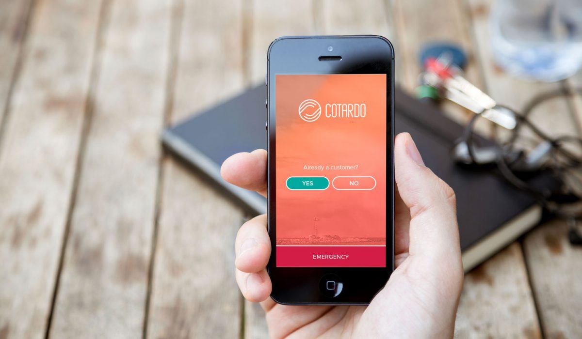
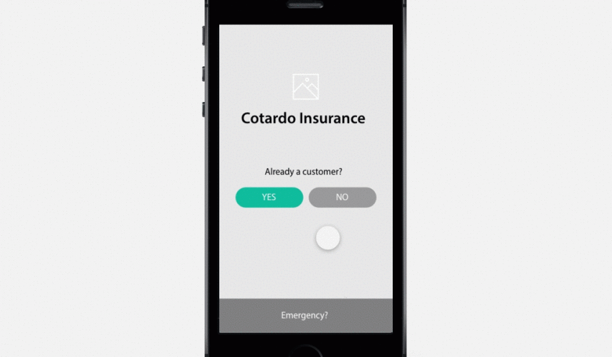
Cotardo
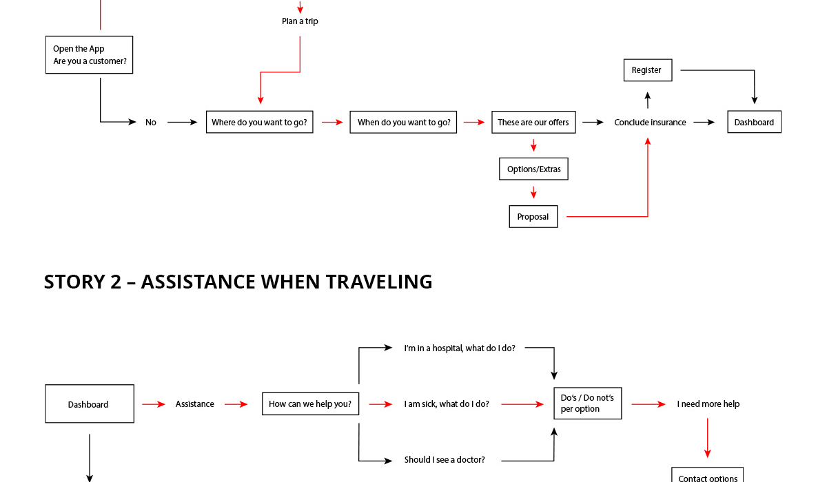
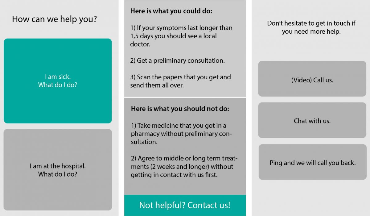
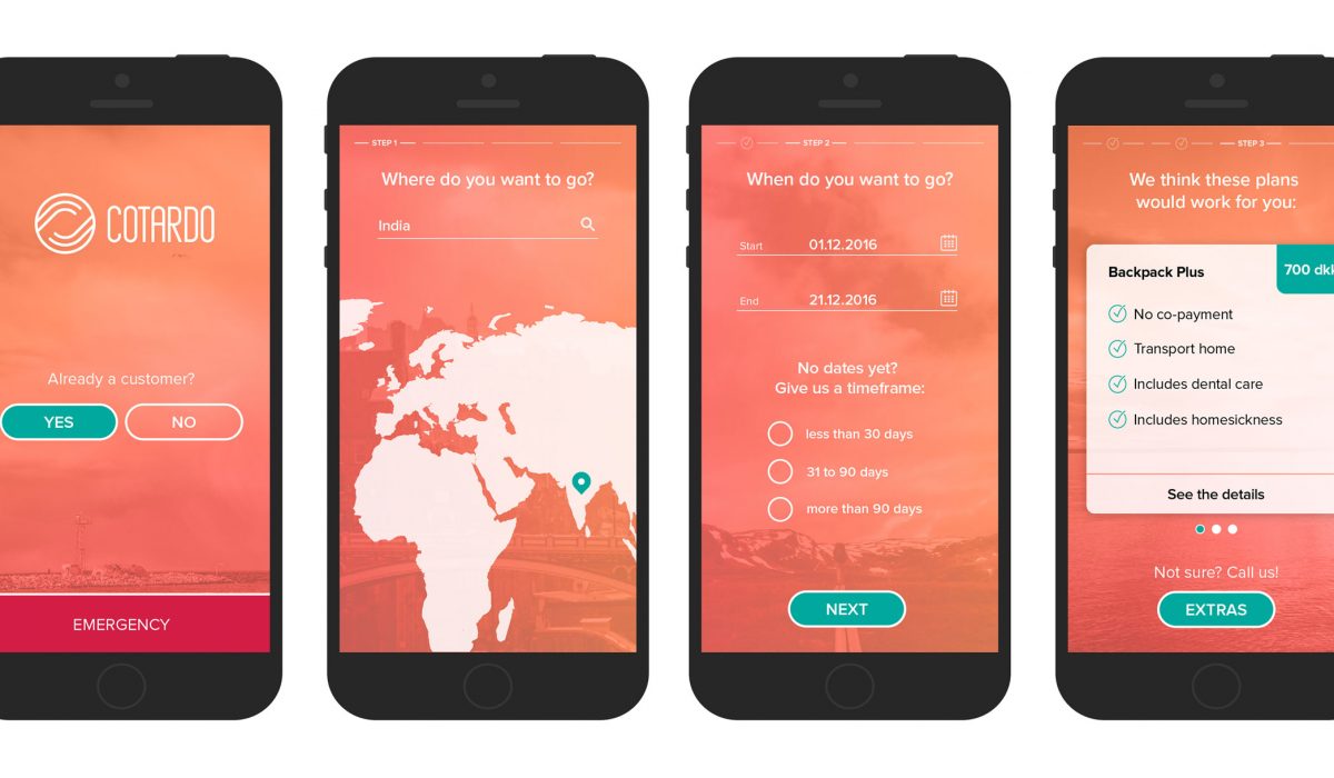
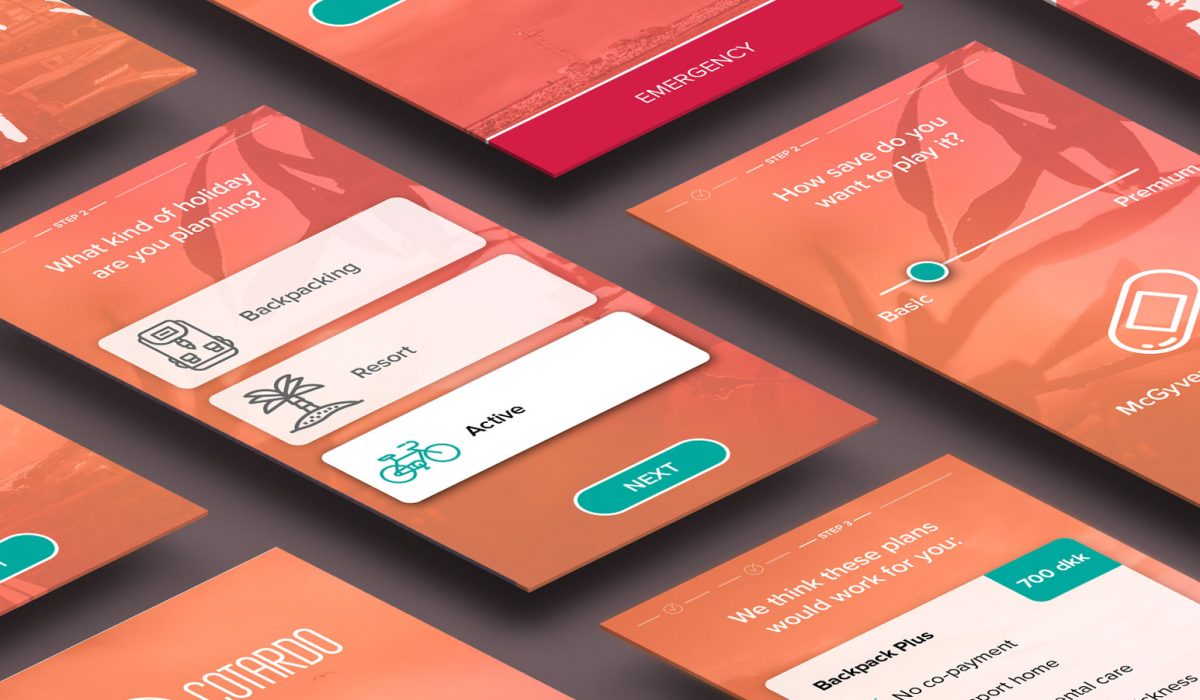
Fictional project Cotardo is a insurance company specialized in travel insurance. They want to boost their business and are developing an app that can help people find the right insurance and provide help when it comes to an emergency abroad. For this project I concentrated on two user stories: A customer is planning a trip and wants to make sure the insurance is optimal. A customer is traveling in vietnam and needs assistance because of a medical issue. I also made some assumptions for both user stories: Both are existing customers Existing customers have an account with the company than can be used for login Network coverage or wifi is available Being an enthusiastic traveller myself, I was able to mostly draw from experiences I had and the help or assistance I would have loved to have before travelling or when being abroad. Story 1 To find the right insurance for a trip the app features an assistant that asks two big questions: Where do you want to go and when? If the exact time is not set, one can choose a timeframe instead. With these two questions answered the app shows insurance suggestions and highlights the biggest features. In […]
Read More ›
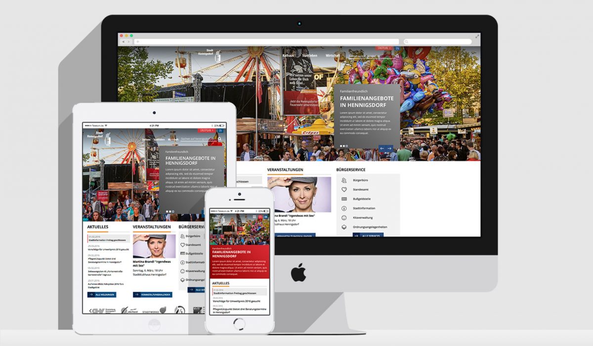
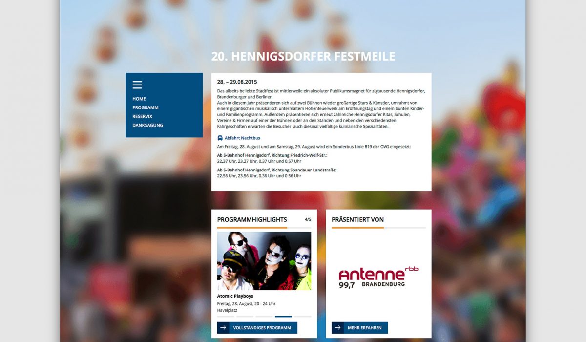
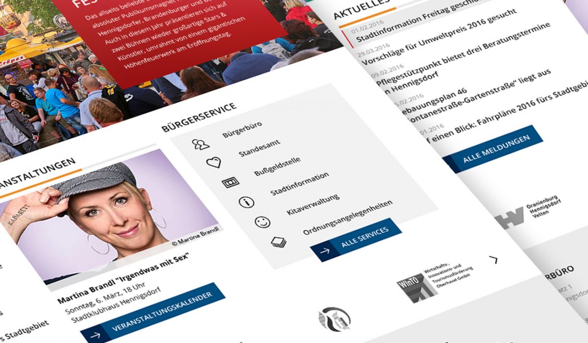
Stadt Hennigsdorf
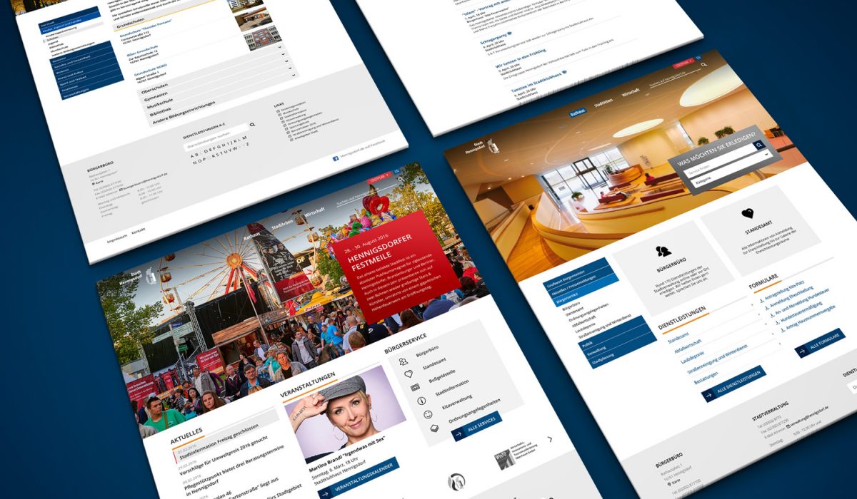
While I was working for Kontur Network, we were tasked in creating concept and design for Hennigsdorf, a city north and just outside of Berlin. The city wanted a more modern look and feel while giving the editors of the site some freedom in displaying their content. It should stay a comprehensive source for all things concerning the city both politically and city life.
The design is based on a 12 column grid and making good use of that especially on the front page and entry pages. These pages use content boxes that can be arranged freely to suit the intent of the page. The hero-image on the front page can either be static or have several slides and both furnishes the site with a modern appeal and serves as a central advertising space for the municipality.
I was lead designer on this project and worked on the concept, multiple site templates and iconography. Typography and colors are based on the cities design guidelines.
The design was then implemented with a customized theme by an external provider.
Read More ›
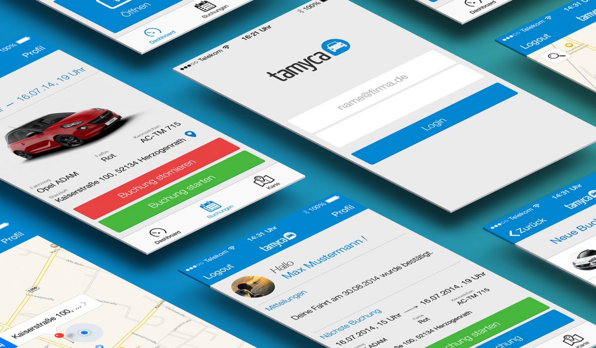
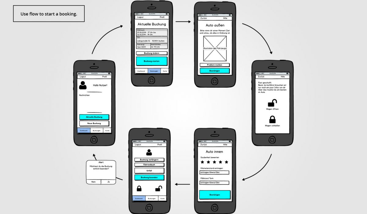
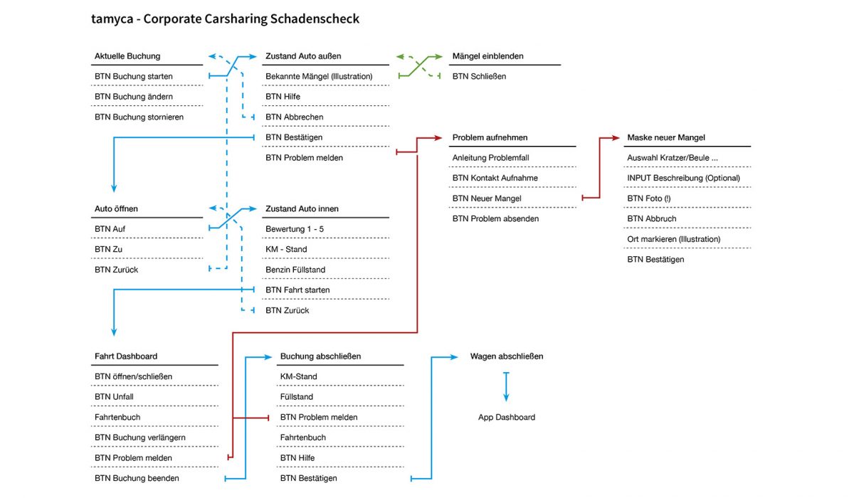
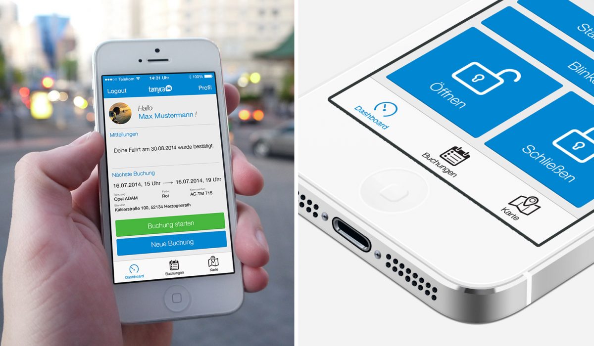
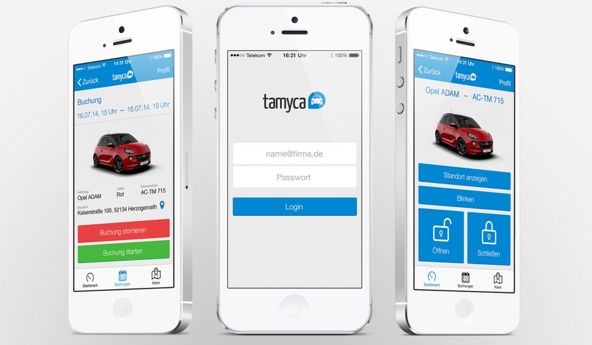
Tamyca Corporate Carsharing
This application was developed for the Aachen based carsharing company tamyca, to extend their current offering from private to corporate carsharing and fleet management. These new offerings added far more complexity to the existing use flow and therefore got outsourced to a new app. I started with a detailed mapping of the necessary features, to ensure that the new system would be easy to use and understand for a new user. The use flow map got translated into wireframes, to structure the hierarchy of the interface elements. From there I designed mock ups for testing purposes and finally created pixel perfect assets for development.
Read More ›
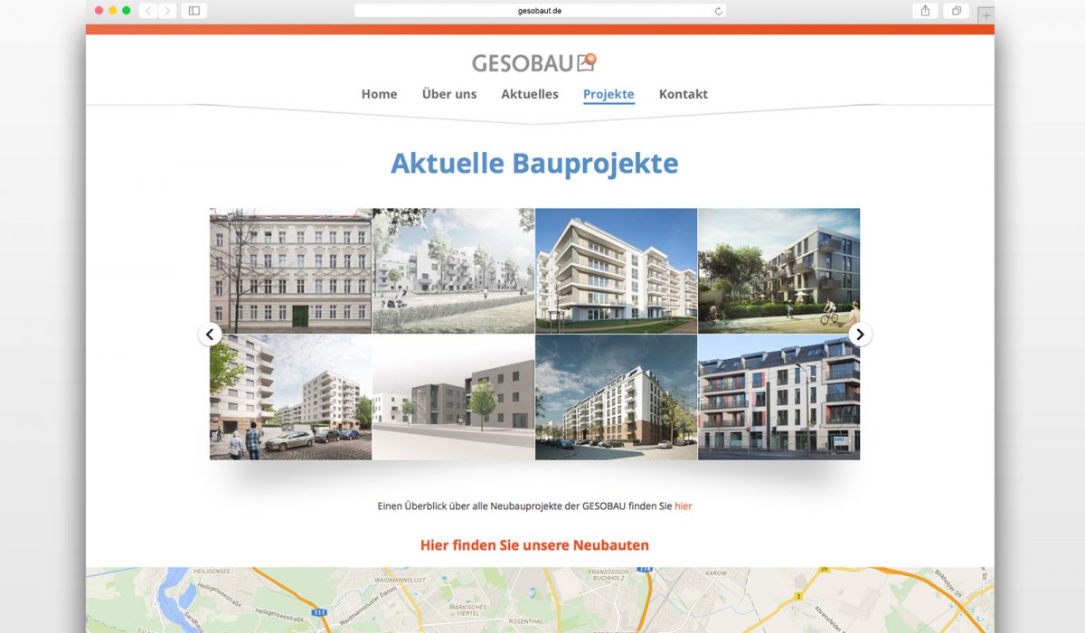
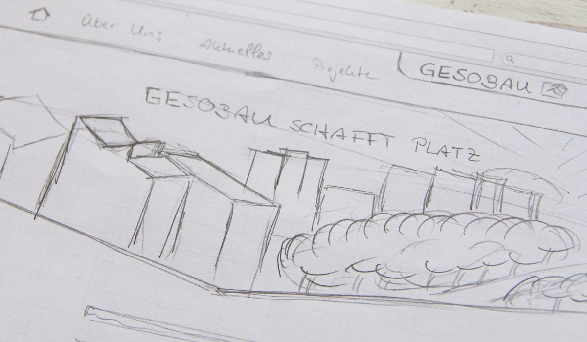
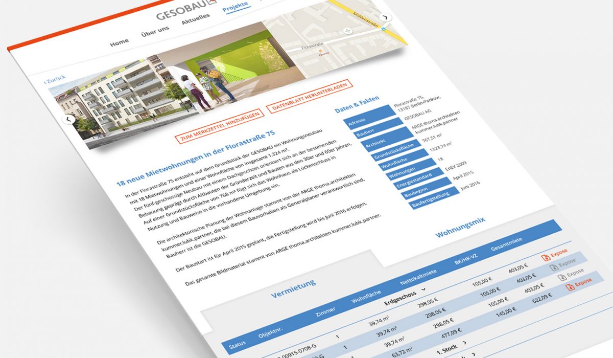
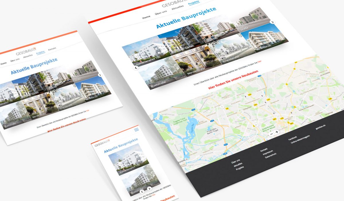
Gesobaut
The GESOBAU is a real estate company which is half owned by the city of Berlin. Since many people are moving to Berlin a lot more apartments and houses have to be built to accomodate these people.
This website was developed to specifically inform about these projects. The main focus of the page is the presentation of the individual developments and showcasing their key figures. When the objects become available for rent the site informs about sizes, cost and availability of the single apartments. The possibility to sign up for a projects watch list, so that potential tenants are informed about availability, is currently in development.
I developed the current design from functionality sketches up to mock ups and supervised the development process in the later stages. At the moment I am working on the design for the watch list in both front- and backend.
Read More ›
 MENU
MENU